
SAP Lineup
Brief
We were asked to come up with an idea for a modern social media app in the enterprise use-case.
Idea
The idea we came up with was - lineup. So whats lineup? Its reddit meets TedX. Lineup was envisioned as a way to stay connected with your company.
Team
It was a team of three people - a User Experience Designer, Researcher and myself. We were all heavily involved in the end-to-end design process which included user research, synthesis, designing the screens, prototyping it and lastly working with the dev team to implement the prototype.
Research
The first step in the project was to learn more about the enterprise social media space so we did a competitive analysis of enterpise social network apps. After understanding our space, we turned our attention to the target users of the app. We wanted to understand how employees use social media platforms for both work and personal matters. We also wanted to learn through which medium employees learn about company related news and events. For user research, we conducted in person interviews with participatory design exercises. The participants were internal employees from various Line Of Businesses including Marketing, HR, Design and Development.
Through the research, we found that user needs consisted of:
- cross-team transparency
- being able to share information with greater community
We also learned some common user behavior:
- Social media is accessed primarily through mobile. Phone have surpassed Desktop usage.
- In social networks, people like consuming information more than they like contributing.
- Also, everyone seemed to have a preference for focused, personalized, news and events.
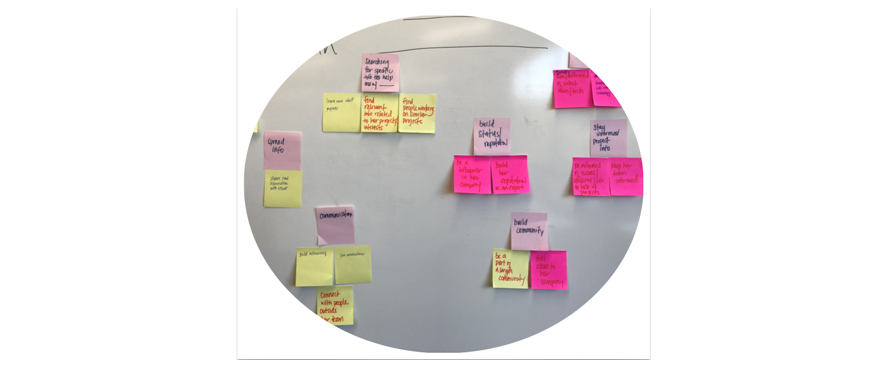
Problem and the Solution
During a 3 day long workshop, we identified the key user problems we wanted to solve - employees wanted to break barriers between work and personal consumption of social media but they couldn’t due to confidential projects at work so we wanted to provide them with a modern platform where employees can talk about internal events and news using similar features that they use in their personal lives.
Some of the high level features we wanted to include in the app were: staying informed of interests and specific internal projects, spread information, follow influencers and general exploration of topics and interests.
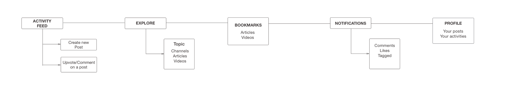
Information Architecture
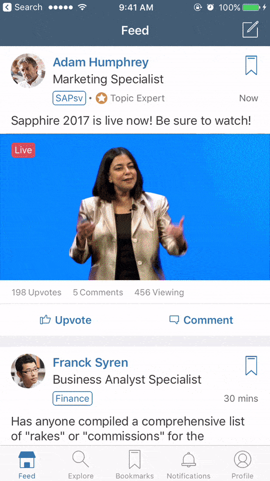
Before diving deep into specific designs, we created an information architecture to help us visualize the main screens and features. We decided to go with flat navigation for this app since it would contain multiple content categories such as feed, explore, bookmarks, notifications, and Profile.
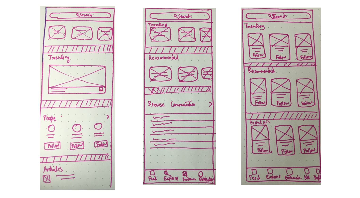
Exploring the Explore screen
Once we knew what the main screens would be, we divided them among ourselves so each of us could focus on a few screens.
Eventually, when the screens were in a more stable state, we worked more collaboratively. I was responsible for Explore, Creating a new Post, Followers, and Notifications screen.
Here are some of the the initial explorations for the Explore screen:
Here are the high-fidelity mockups:
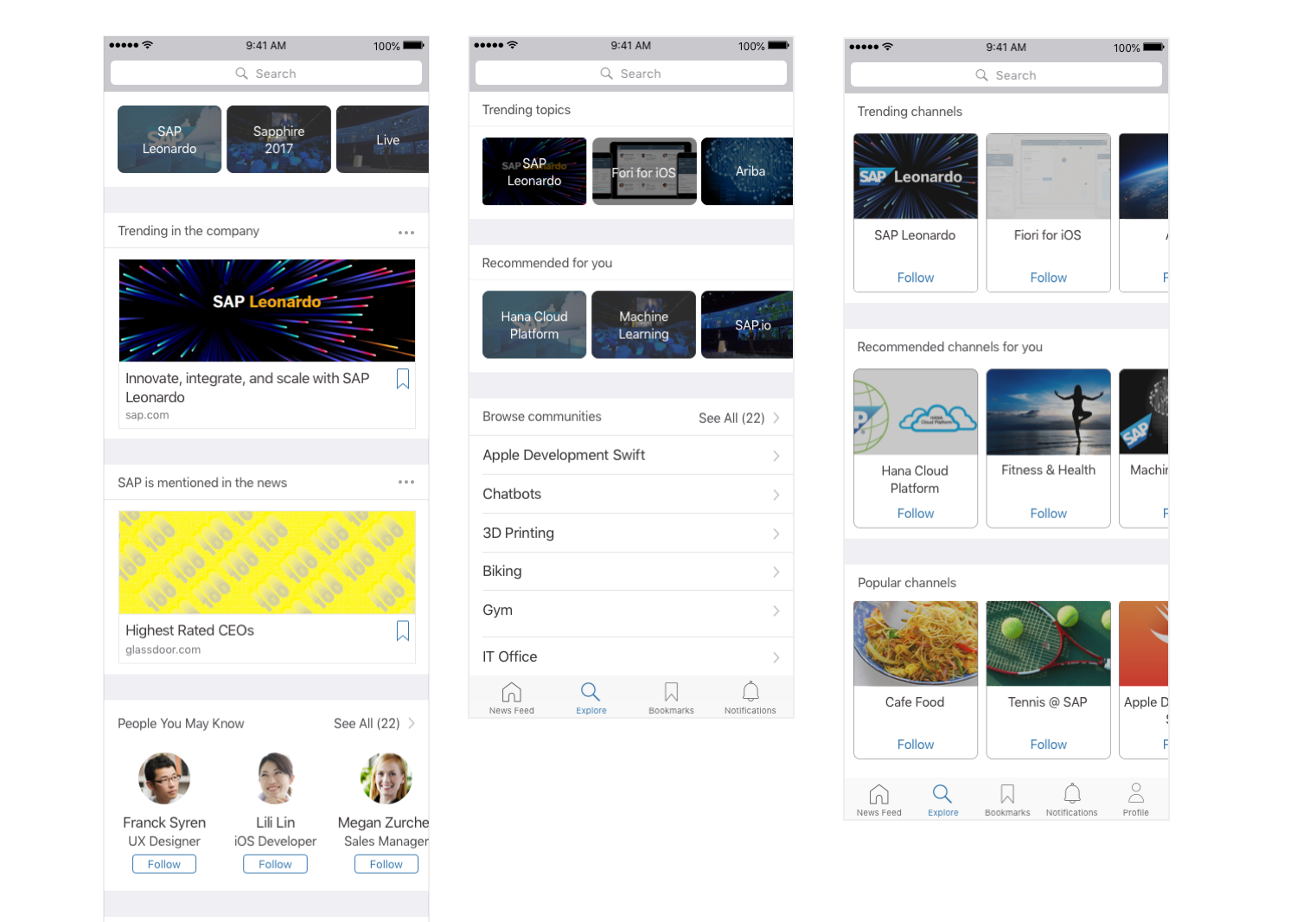
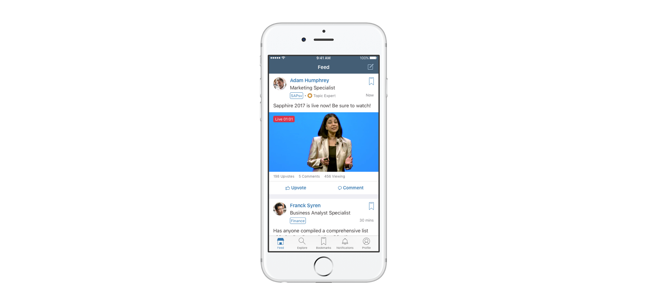
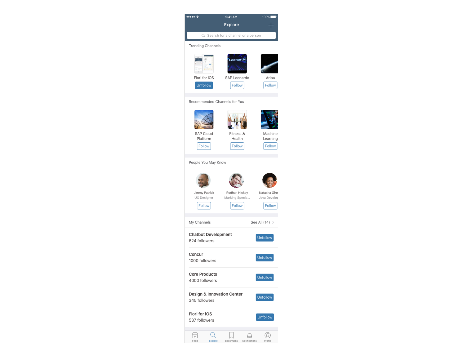
After many discussions, this was the final solution for the Explore screen that we went with. I removed the card borders for a cleaner look. Replaced the "Following" state of the buttons with "Unfollow" action. Instead of showing the "Popular Channels" section, we decided to show "My Channels" for quicker access.
Design Handoff
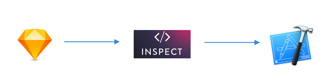
Once our designs had matured enough, I used Invision’s Inspect to handoff the designs to the dev team. I also used Flinto and Invision to create interactive prototypes for the screens so the dev teams could understand the interactions in the app better.
Usability Testing
Due to the project timeline, we ran usability testing in parallel to the implementation of the app. We wanted to do concept validation and discover issues. We ran 45 minutes sessions on employees from various line of businesses using interactive prototypes and then updated designs based on the feedback we received during usability testing and design reviews.
Demo and Outcome
The app was demoed at SAP TechEd Conference in Las Vegas and Barcelona in September of 2017 and received positive feedback. Since I left SAP soon after the demo, I am not aware of any further progress on this project.
Learnings
As with any project, there were some things that worked well and others that didn't.
- One of my biggest learnings from this project was that how well a team works together really makes or breaks a project.
- Being able to explore without getting attached to a particular design was very helpful for us to think objectively.
- the last but not the least thing I learned was a genuine interest in the work you’re doing will be the biggest motivation. Since our dev team was in India, we had to work at odd hours to accommodate the time difference but the team’s passion in this project was so motivating that we didn’t mind that schedule at all.